It is easy to scoff at data visualizations, a technology many see as promising much, but delivering little. However, recent versions of data visualization tools are finally arriving to fulfill the claims of instant insight across data sets. In many cases, part of the problem with ready-made tools has been an over-reliance on the wrong ones.
 Computer Weekly, in their Essential Guide by Gareth Morgan, argues that one aspect of what sets apart the new breed of data visualization tools, is that they can provide different ways of presenting the data. As the old adage goes, information is beautiful and the new way of presenting this is making it easier to understand the data.
Old BI tools rely too heavily on bar charts, line charts, and other one-dimensional graphs. Advanced data visualizations are much more likely to be using other intuitive methods of presenting information, like word clouds, geospatial heat maps, and bubble charts.
Of course, the majority of data that whizzes past executives’ desks is, and always will be, noise. Signals in any data set are the exception rather than the rule. However, modern visualization tools give executives the ability to discern quickly where the insights they crave exist. This has happened because they can now zoom in on sub-sets of data where they notice an initial spike or drop, for example in sales.
Human-Computer Interaction (HCI) first emerged in the 1980s and has now become a major part of the design in data visualization tools. This is specially so where mobile devices – and the need for on-the-go access to information – are concerned. Research in this area has led to explorations into how well users can interact with the data visualizations when using devices with displays ranging from typical Smartphones to oversized multiple-monitor display systems.
The requirement for fully immersive experiences is covered in an article by Thibault Reuille, for Open DNS Security Labs. The reality of 3D landscapes has been made a reality by the huge data centers, capable of processing the large amounts of information. The evolution of data visualization will almost certainly redefine the limits of what we currently know. As the advances in virtual and augmented reality continue apace, the interfaces on data visualization tools are certain to follow.
One thing is clear, that the possibilities for advanced data visualization are almost endless. The more we know about the human body, and the more that technology proceeds, the more we will be capable of designing ergonomic interfaces. A lot of existing and emerging new technologies are on the verge of enabling such capabilities and there is no doubt that they will be part of the workstation of the next generation.
Big Data and related technologies – from data warehousing to analytics and business intelligence (BI) – are transforming the business world. Big Data is not simply big: Gartner defines it as “high-volume, high-velocity and high-variety information assets.” Managing these assets to generate the fourth “V” – value – is a challenge. Many excellent solutions are on the market, but they must be matched to specific needs. At GRT Corporation our focus is on providing value to the business customer.
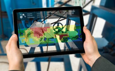
How PowerLink Provides a Holistic View of Your Electric Assets
Through electrical signature analysis (ESA), GRT PowerLink performs careful electric asset health monitoring,...